.png)
Haier & B Hvac
Türkiye İklimlendirme Sektöründe Dev Bir Güç Birlikteliği
Dünyanın Bir Numaralı Markasından 5 Yıl Garanti
Duvar tipi birebir split klimalarımız ve 24K Cabinet ürünlerimiz artık 5 yıl GARANTİ kapsamında!
✓ Ürünlere duyulan güven (yüksek standartlarda ve üst kalite komponentlerle üretilen güçlü klimalar)
✓ Müşteri memnuniyetine olan bağlılık (uzun vadede sorunsuz ürün ve hizmet sunma taahhüdü)
✓ Teknolojik ve donanımsal üstünlükler (Konfor, güvenlik ve ürün ömrünü arttıran gelişmiş özellikler)
Devamını Oku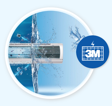
Temiz Hava
3M Hava filtresi
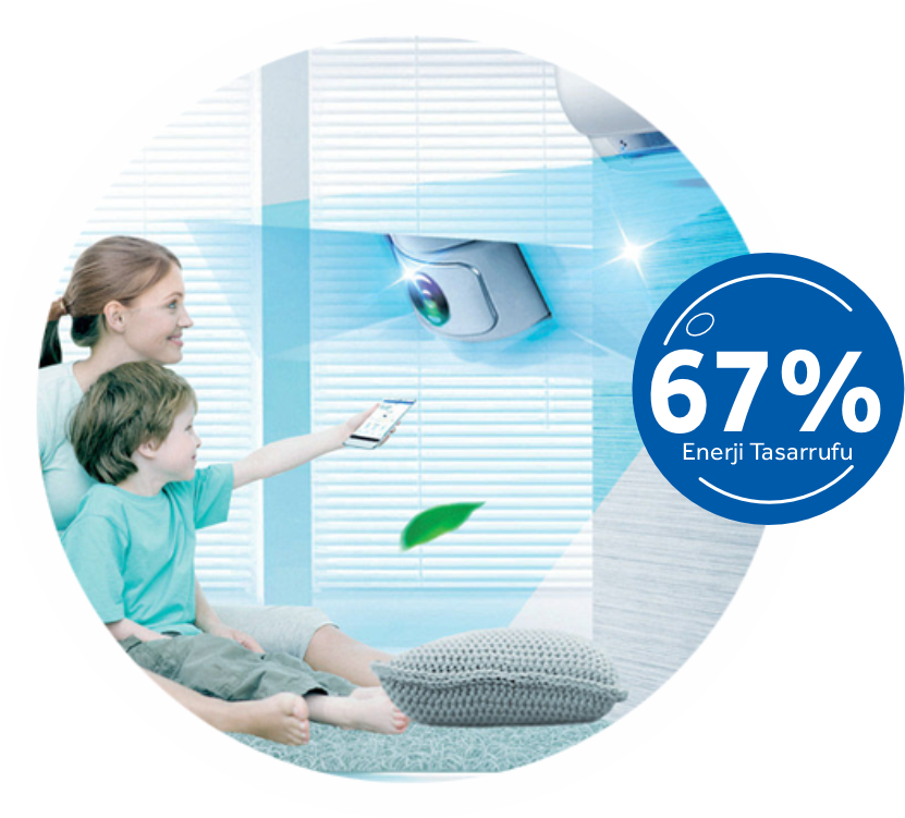
Akıllı Sensör
Akıllı Sensör Teknolojisi
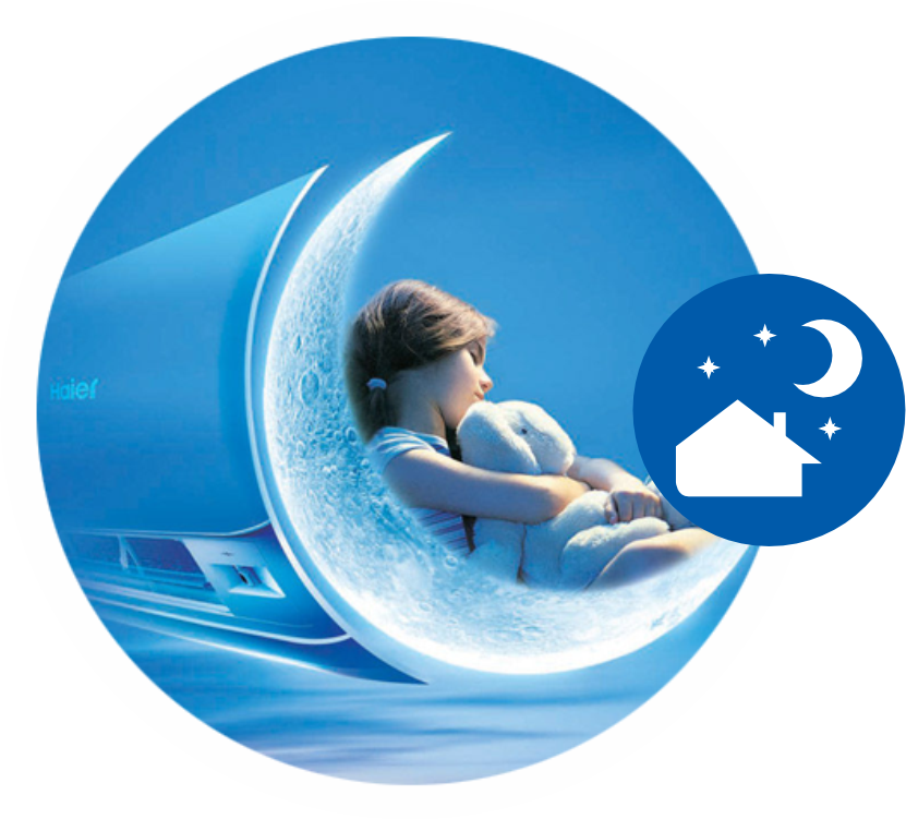
Uyku Modu
Sessizlik...
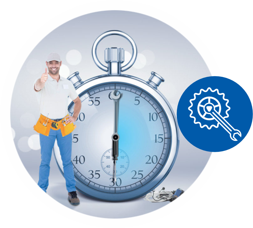
Kolay Kurulum
Montaj kolaylığı yenilikçi teknolojilerle Haier klima sistemlerinde
.png)
Yüksek Kalite
En yenilikçi teknolojilerle üretilen Haier klimalar
.png)
DC Inverter Teknolojisi
Haier DC Inverter Klimalar
.png)
Haier hOn arayüzü ile uzaktan kontrol edilebilen Wi-Fi Kontrollü klimalar
.png)
UVC Teknolojisi
Ultraviyole jeneratörü ile 99,9% oranında temiz iç ortam havası... Tüm mikroplar ve virüslerden arının...
.png)
Maksimum Konfor
Hassas sıcaklık kontrol teknolojileri ile maksimum konforu evinize taşıyın...
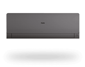
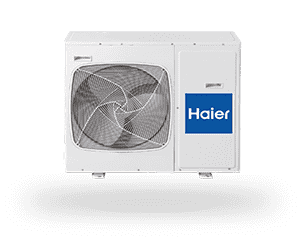
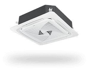
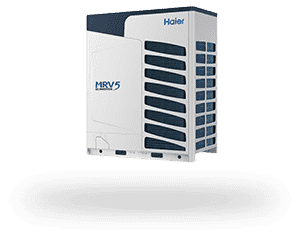
Ürünlerimiz
Global Pazarda 1 Numaralı Klima Markası
Ürünlerimizi İnceleyin!
Detaylı bilgi almak, Sipariş vermek ve Önerileriniz için bizimle iletişime geçebilirsiniz.
Görüşler
Müşterilerimizden Yorumlar
Lorem ipsum dolor sit amet, consectetur adipiscing elit. Sed imperdiet libero id nisi euismod.
Lorem ipsum dolor sit amet, consectetur adipiscing elit. Sed imperdiet libero id nisi euismod
Lorem ipsum dolor sit amet, consectetur adipiscing elit. Sed imperdiet libero id nisi euismod

Avantajınız
Haier klimalarımıza nasıl sahip olabilirsiniz?
İnternet sitemizde yazılı bulunan yetkilendirilmiş bayilerimize telefonla ulaşarak, bayilerimizin mağazalarını ziyaret ederek ya da bizleri aradığınızda sizi yönlendireceğimiz size en yakın bayimizle irtibat kurarak Haier klima sistemleri ürün grubundan dilediğiniz modele sahip olabilirsiniz. Önemle hatırlatırız ki, firmamıza ait bir online satış sitemiz bulunmamaktadır. Klima ürünlerimizi tercih ederken üründen maksimum verimi alabilmek için, doğru alana doğru kapasiteli ürünü doğru pozisyonda konumlandırmak çok önemlidir. Bu husustan dolayı, satın alma öncesinde mutlaka işinin uzmanı bir bayimizden keşif ziyareti talebinde bulunabileceğinizi ve teknik destek alabileceğinizi hatırlatmak isteriz.
Test Yazı
B HVAC Mühendislik A.Ş. Kimdir?
B HVAC Mühendislik A.Ş. iç mekan iklimlendirmesi, inşaat ve otomotiv alanlarında faaliyet göstermek hedefiyle kurulmuştur. İlk yatırımını iklimlendirme sektörüne yapan firmamız, Haier markalı klima sistemlerinin Türkiye distribütörlüğü anlaşmasını Nisan 2017’de imzalamıştır.
Devamını Oku